MarinaTex has designed a new type of material to replace specific single use plastic film in packaging, consumables and food items – a bio-plastic – that is made from 100% natural ingredients. This brief was a challenge set by Dyson to design a visual identity for MarinaTex that reflects what it is and why it’s a better and more sustainable alternative to plastic.
Founder Lucy Hughes developed the alternative to plastic from fish skins and scales due to their flexibility and strength- enabling proteins. As the fishing industry alone produces 50 million tonnes of waste each year, MarinaTex solves this problem using only waste materials.
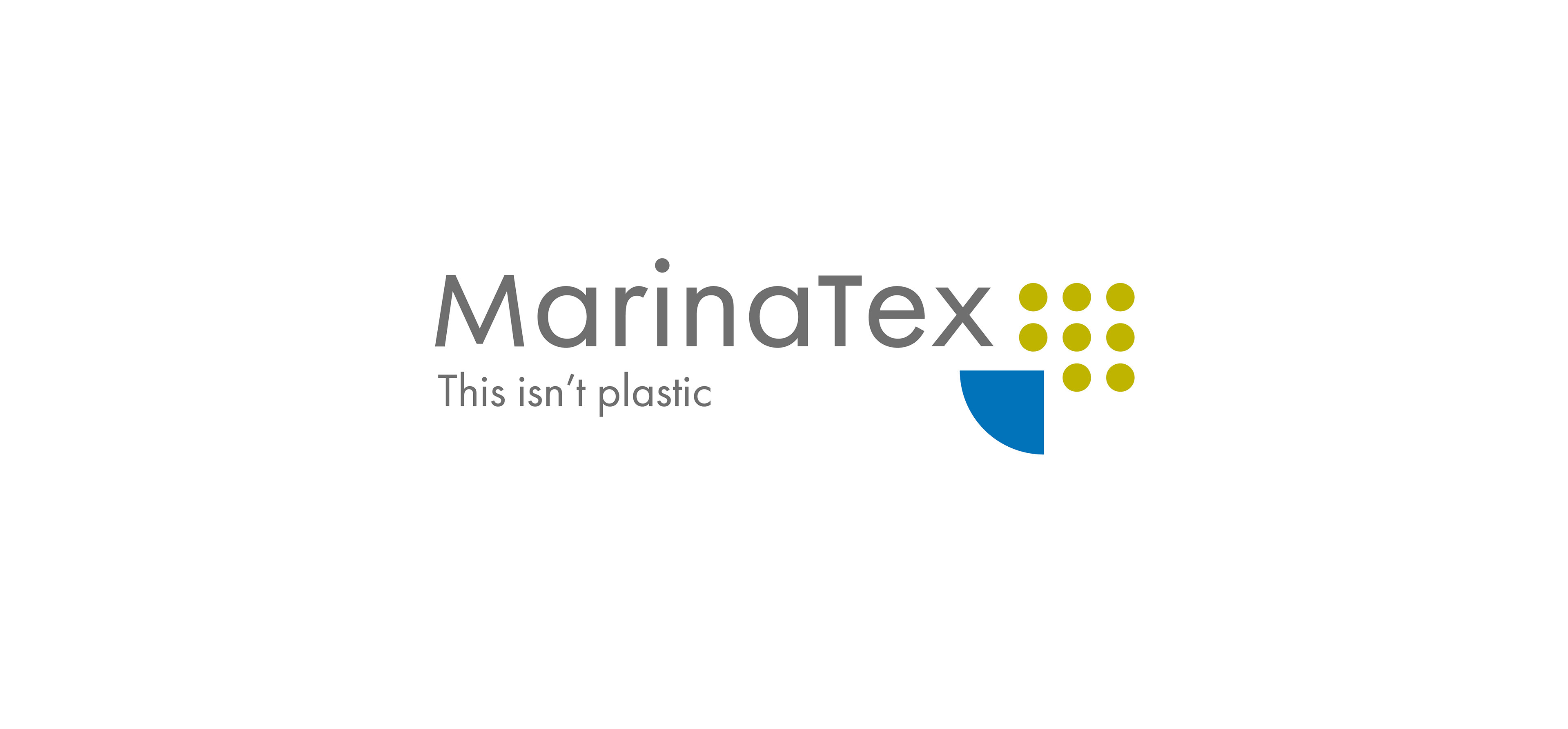
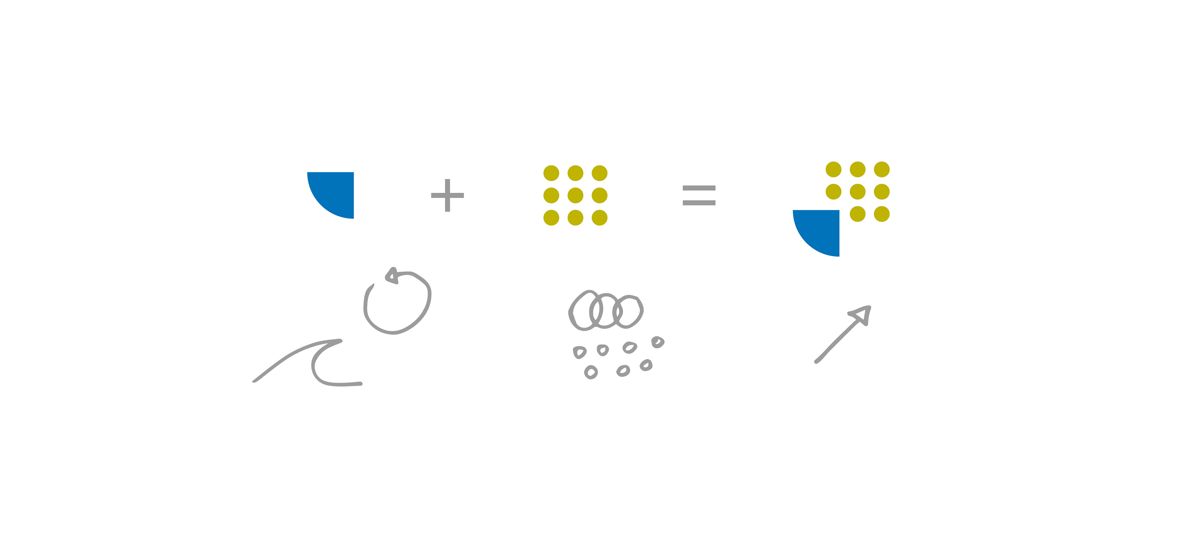
The logo represents the relation between sea and earth, considering the materials from MarinaTex come from fish waste and biodegrade on the earth completing a cyclical structure.
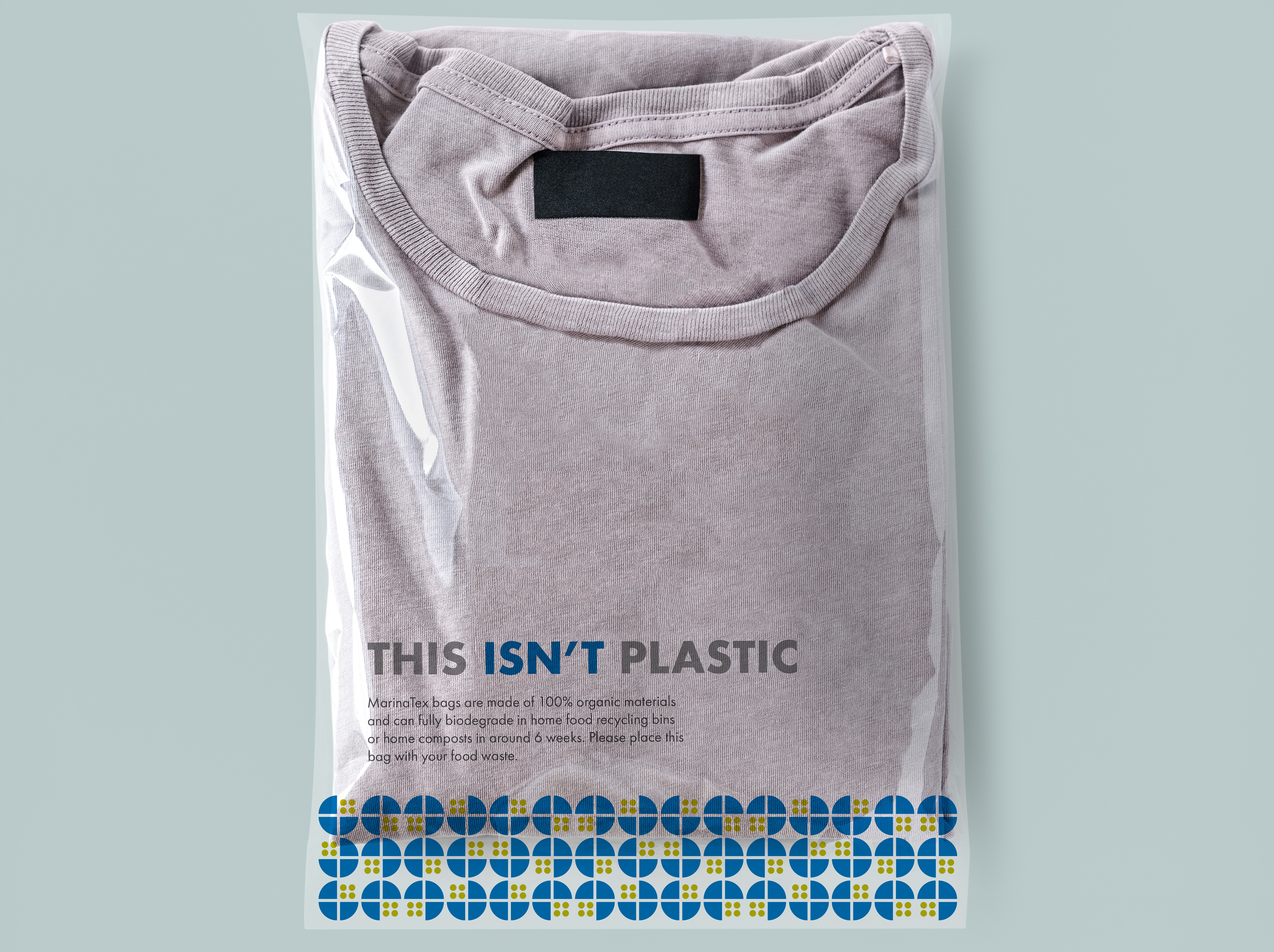
The first option of packaging is for partnerships when MarinaTex is free to present its identity and brand. The geometric shapes from the logo can form endless possibilities of interesting patterns, still keeping inside the brand guidelines.
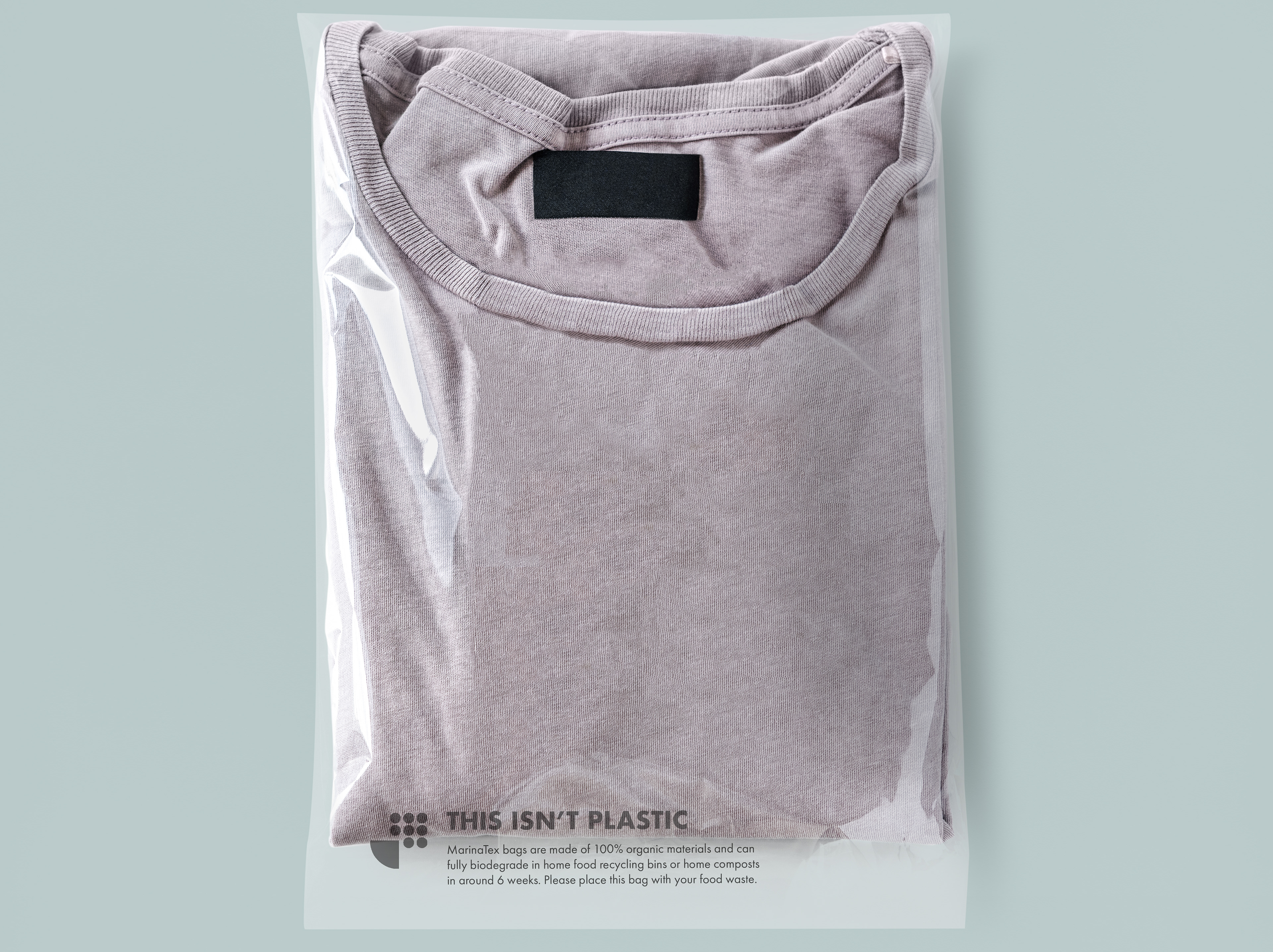
The second packaging is for when MarinaTex is the secondary brand and can't interfere in the primary brand identity. The packaging is neutral and support the primary brand, but still communicates the message. The logomark can work as an icon for biodegradable products.
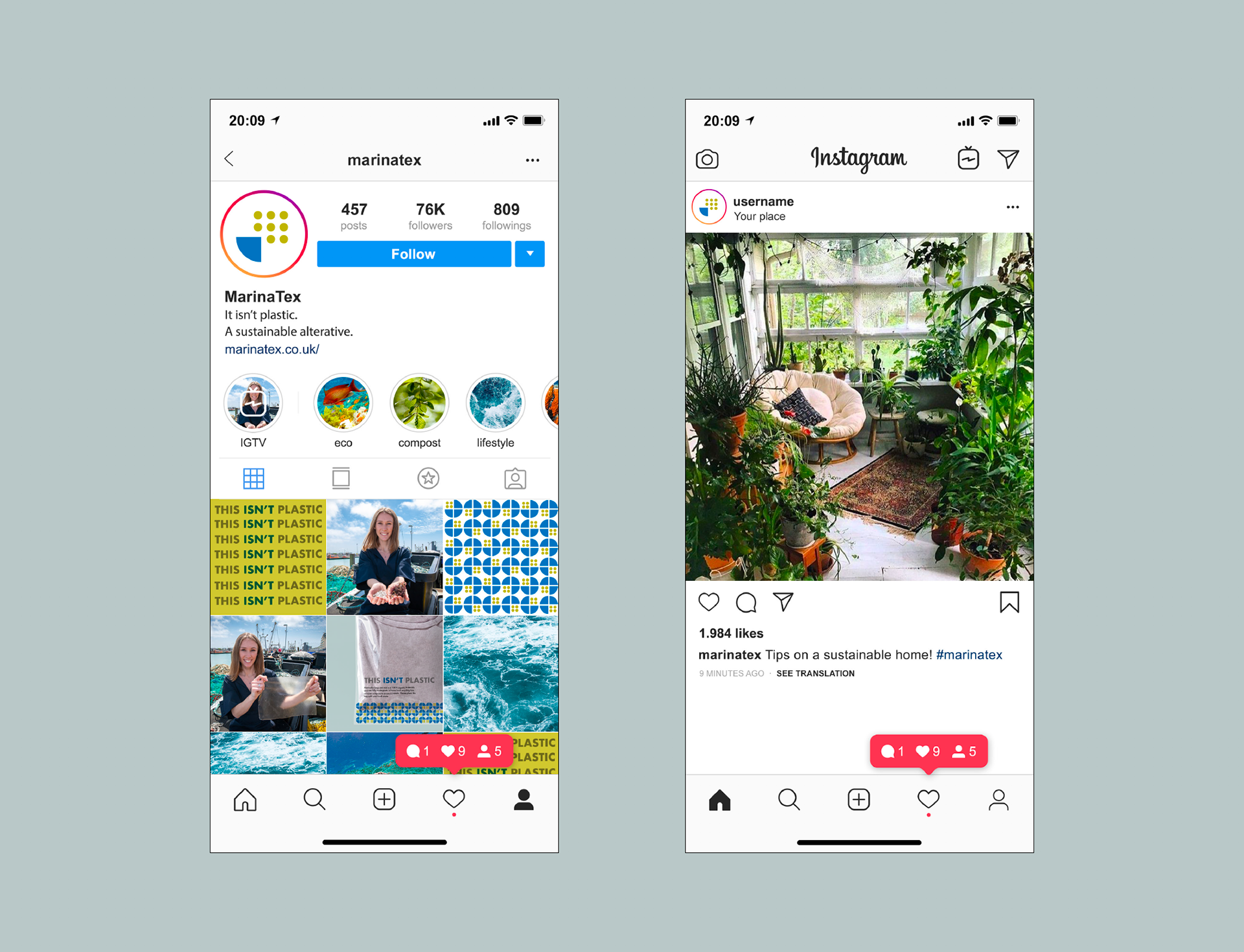
My suggestion for a digital campaign would be to keep it informative and personal. Tips on how to life a more sustainable life and how to dispose the material would promote MarinaTex and bring the brand closer to its consumers.
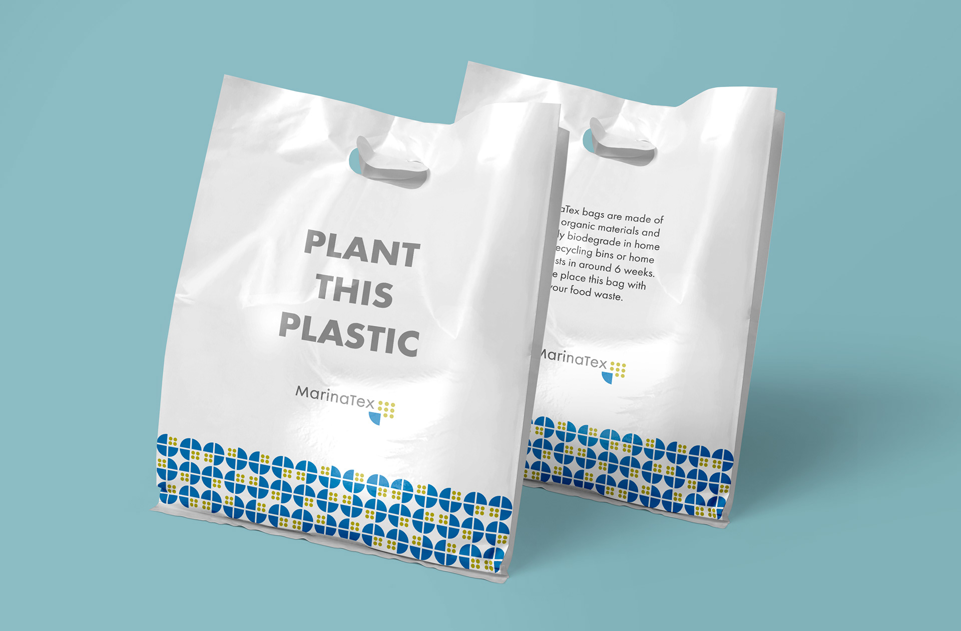
A physical campaign would challenge the consumer by inviting them to plant the plastic alternative. The campaign would allow the consumer to experience the decomposition of the material, acknowledging how inoffensive the material is to the environment.